


Elements · Components

Buttons & links

Buttons are the smallest element with the biggest say in how the site feels. These variations compare fill styles, corner radius, sizes and loading states, then the hover effects on offer, from a quiet spring lift to a shine sweep. Link styles and segmented groups sit at the end.

6 variations

Select every variation you like — your picks are saved in this browser.

Fill styles and corner shape

Solid, soft, outline, ghost and gradient fills on light and dark, with one switch that flips every button from 12 px corners to pills.

  • fill
  • radius
  • on dark
Corner shape
Solid The default: primary for the main action, secondary and accent for the tones each theme allows.
Soft Tinted fill, ink or primary-deep label. Quiet enough to sit inside cards and tables.
Outline Primary border, transparent fill; fills soft on hover. Pairs with a solid button as the second action.
Ghost No border until hover. For toolbars, table rows and Cancel-type actions.
Gradient The CTA gradient (ink → primary-deep) so the white label keeps 4.5:1 on every stop; the gradient slides on hover.
Explore Tech Trek
On a dark band Accent stays the one CTA colour; inverse, outline and ghost switch to ink-inverse.

On the site: Solid primary is reserved for the one main action per screen — Request a specimen. Soft and outline cover secondary actions inside cards and tables, ghost lives in toolbars and dense rows, gradient only on the hero and CTA bands. Pick the corner shape once: it applies to every button, chip, input and menu on the site.

0/200

Sizes, icon positions and full-width

Four sizes with the same label, icons left, right and alone, a two-line label, and how the primary CTA behaves on a phone.

  • sizes
  • icons
  • responsive
Sizes Small 36 px (tables, cards) · Medium 44 px (default) · Large 52 px (bands) · Extra large 60 px (hero only).
Icon left / right Leading icon names the action (download, call); trailing arrow means 'goes somewhere' and nudges on hover.
Icon only A square of the same height; the name is an aria-label, so it reads correctly and stays 44 px or more.
Two-line label Action on the first line, the reassurance on the second. Only for the primary CTA.
Call +91 184 225 4445Mon–Sat, 9 am – 6 pm IST
Full width on phones Below 640 px the pair stacks and stretches edge to edge; from tablet up it sits inline. Resize to see it.
Browse all series

On the site: Large on the hero and CTA bands, medium everywhere else, small inside tables and cards. Icon-only buttons always carry an aria-label and never drop below 44 px; on phones the page's primary CTA runs full width so the thumb cannot miss it.

0/200

Loading, disabled, done and pressed

What a button does while the form sends, when it cannot be used yet, once the job is done, and when it is a toggle.

  • states
  • a11y
Loading → done Press it: spinner and 'Sending…' for 1.6 s, then a green 'Sent' with a toast, then back to idle. Screen readers hear each step.
Disabled with a reason The button stays visible and focusable (aria-disabled) with the reason beside it; tick the series and it wakes up. The truly disabled one is skipped by Tab.
Select at least one series first
Pressed (toggle) aria-pressed flips the fill; the label changes with it so the state is never colour-only.
Done and destructive Success and danger fills use the fixed status colours, so they read the same in A, B and C.

On the site: Every form submit shows the loading state, then a done state or an error toast, and the label changes with the state so nothing is colour-only. A control that cannot be used yet stays visible with the reason next to it (aria-disabled) instead of vanishing; true disabled is only for actions that will never apply.

0/200

Hover effects

Six ways a button can answer the pointer. Each is one effect in isolation; the site would use at most two.

  • motion
  • hover
  • keyboard

Spring lift

Rises 4 px on a spring and gains the pop shadow. The house default for primary CTAs.

Tab focus lifts it too

Magnetic

Pulls toward the pointer and presses down on click. Hero and CTA band only.

Pointer only — nothing is lost on keyboard

Shine sweep

A soft highlight crosses the gradient once per hover. Pairs with the gradient fill.

Tab focus sweeps it once

Fill sweep

An outline button fills from the left and the label flips to white. Good for secondary actions.

Tab focus fills it

Ripple

A wave spreads from the point you press. Familiar from phones; suits the parent-facing theme.

Enter or Space ripples from the centre

Icon nudge

Only the arrow moves, 4 px on a snappy spring. The quiet cue for 'this goes somewhere'.

Pointer only — the focus ring still shows

All six stop under the reduced-motion switch in the header and scale with the motion intensity chosen on the overview.

On the site: Pick at most two: one for primary CTAs (lift, shine or fill) and the icon nudge for arrow buttons and links. Magnetic pull is reserved for the hero. Every effect switches off with reduced motion, and the CSS ones fire on keyboard focus so nobody misses the feedback.

0/200

Link styles

Text links in running copy, animated underline, marker highlight, arrow slide, external links, a cover link card, and the same set on a dark band.

  • links
  • text
  • cards
In running text Underlined, primary-deep, thicker on hover. The only style allowed inside paragraphs.

Every series ships with a Teacher's Resource Manual, ITM modules and ACT tests, and the Class 9–10 titles follow CBSE skill subject codes 402, 417 and 165.

Animated underline The line grows from the left on hover and focus. For stand-alone links under a heading.
Marker highlight An accent-soft highlighter stroke that swells to a full block. One phrase per band, never in tables.

Specimen copies are free for schools — request them for any series and class, and a Teacher's Resource Manual comes with every order.

Arrow slide The arrow leads and a shaft grows behind it. The 'see all' link at the end of every card row.
External Arrow-up-right nudges out of the corner; opens in a new tab and says so to screen readers.
Cover link The whole card is one link: cover, series, platform and the price from. Used in the mega menu and 'related series' rows.
On a dark band Same styles in ink-inverse; the marker uses the accent at 45 %.

On the site: Underlined links inside running text; arrow links at the end of card rows and sections ("See all series"); the marker for one highlighted phrase per band; cover links in the mega menu and related-series rows; external links always with the icon and a new-tab note.

0/200

Button groups, segmented and split

A segmented control and toggle chips that really filter the 18 series, a connected action group for an ISBN, and a split button that keeps the phone and WhatsApp alternatives one click away.

  • groups
  • filter
  • menu
Split button Primary action plus a menu of alternatives. Arrow keys open and move, Escape closes and returns focus.
Segmented Real radio buttons under a sliding thumb: Arrow keys move, the selection filters the list below.
Toggle chips Multi-select with aria-pressed; combine with the class range.
Result What the two controls above select, live.

18 of 18 series

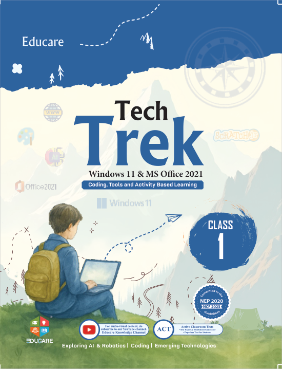
  • Tech TrekClasses 1–8
  • Explore ItClasses 1–8
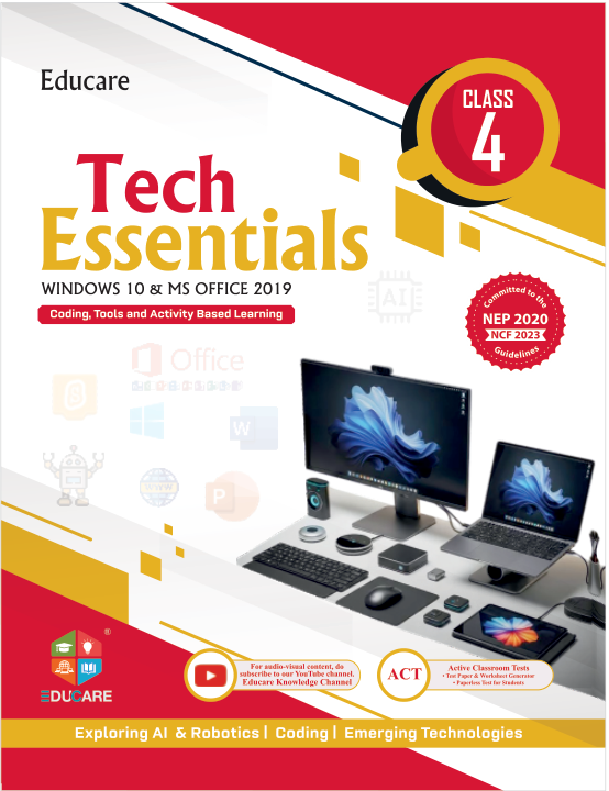
  • Tech EssentialsClasses 1–8
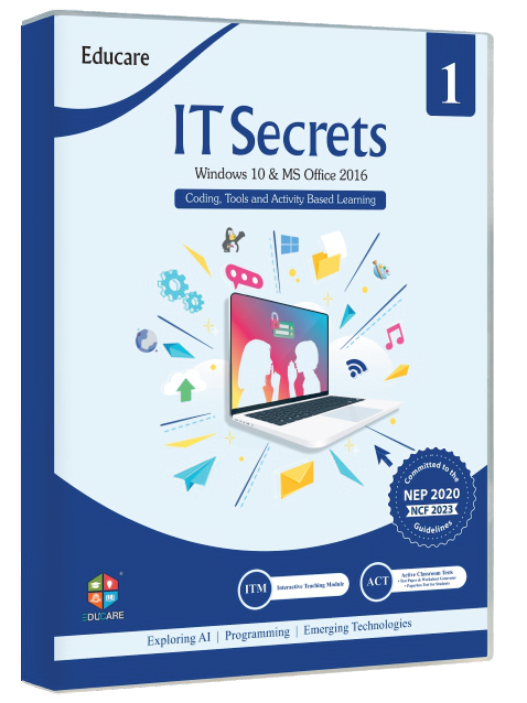
  • IT SecretClasses 1–8
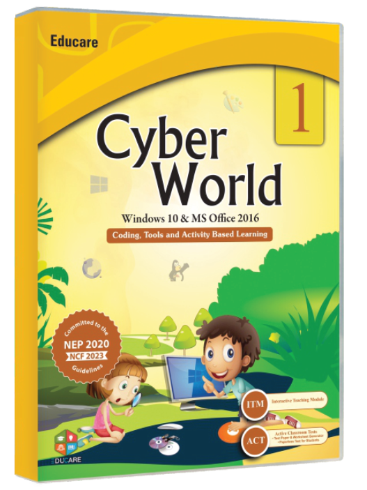
  • Cyber WorldClasses 1–8
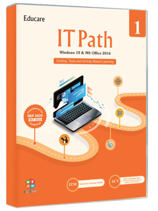
  • IT PathClasses 1–8
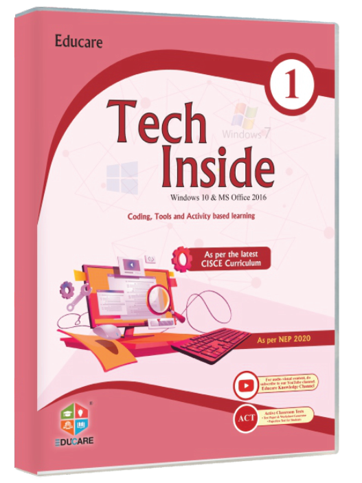
  • Tech InsideClasses 1–8
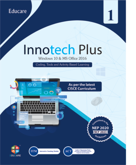
  • Innotech PlusClasses 1–8
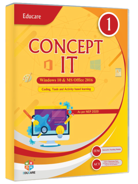
  • Concept ItClasses 1–8
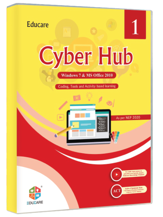
  • Cyber HubClasses 1–8
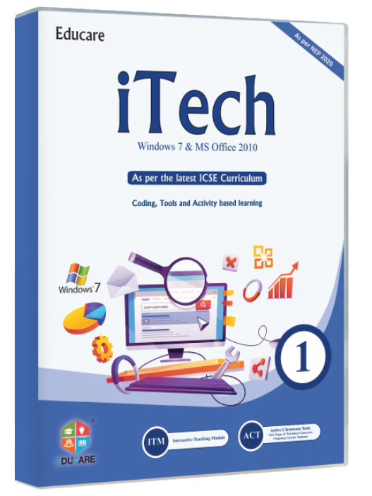
  • iTechClasses 1–8
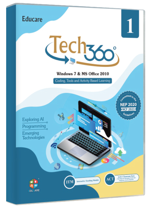
  • Tech 360Classes 1–8
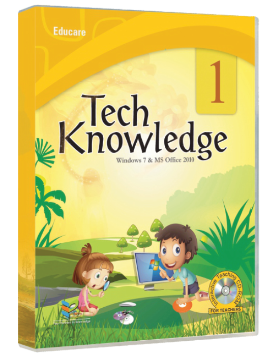
  • Tech KnowledgeClasses 1–8
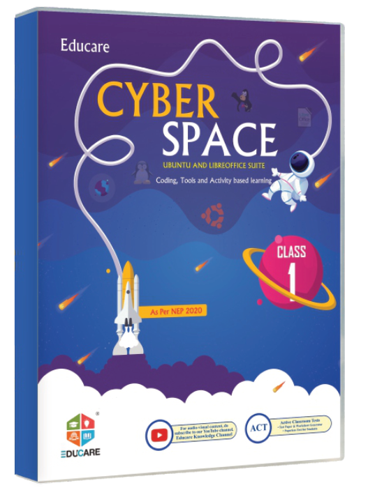
  • Cyber SpaceClasses 1–8
  • Artificial IntelligenceClasses 1–10
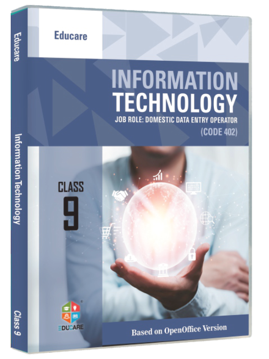
  • Information TechnologyClasses 9–10
  • Information TechnologyClasses 9–10
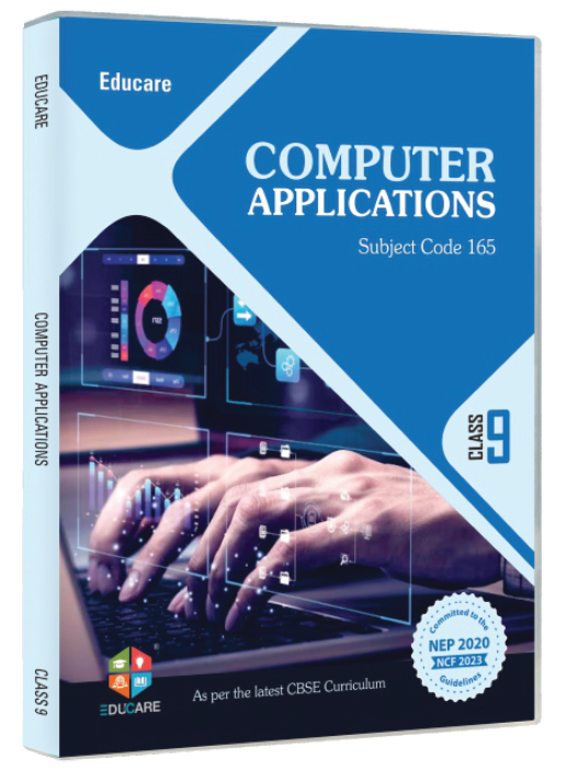
  • Computer ApplicationsClasses 9–10
Connected group Small related actions share one outline. Here: the ISBN row of a book table.
Cover Share

On the site: Segmented controls switch one view (class range, cover A/B); toggle chips filter the lists on /books; connected groups hold the small actions in book tables (copy ISBN, cover, share); the split button pairs Request a specimen with the phone and WhatsApp routes in the header and CTA bands.

0/200

Windows is set to reduce animation. This proposal plays its full motion so you can judge it.

Motion is off