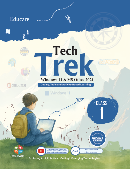

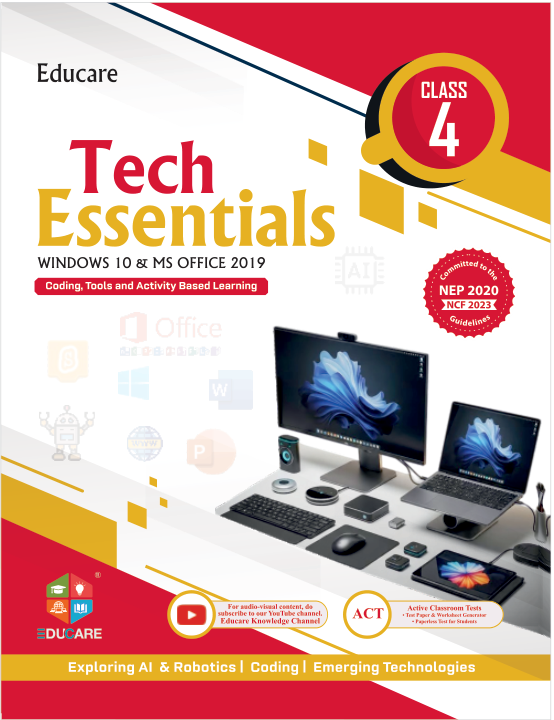
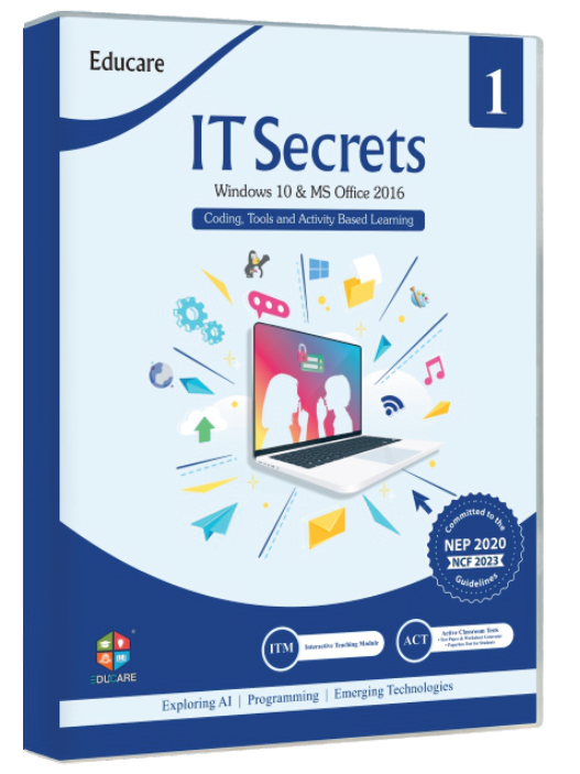
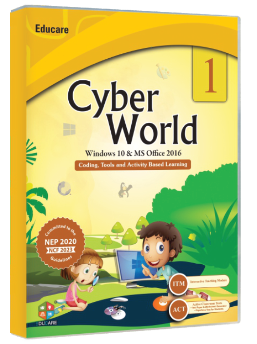



On the site: The site-wide footer after any light band — the wave takes the colour of the band above it (surface or surface-2). Wave, ribbon and beam are CSS loops, doodles and the shelf lift are motion.dev; all static under reduced motion. Back-to-top scrolls to the top of this preview here and to the page top on the site.
Elements · Structure
Footers
A footer carries the contact details, the sitemap and the last call to action on every page. These variations keep the same links and the tech-updates signup but change the mood, from a light paper edge to a compact dark mega-footer. Each is fully working, including the mobile accordion and back-to-top.
5 variations
Select every variation you like — your picks are saved in this browser.
On the site: Use when the page above ends on the page colour: the wave is masked in that colour and drifts 15 rem every 24 s (static under reduced motion). The paper grain is a 1 px ink dot at 7 %, so Theme C's warm off-white reads as real paper. Links are ink-muted → primary-deep on hover.
On the site: For sites that want the footer out of the way — catalogue and solution pages where the CTA band above already closes the page. Every column stays open on mobile if the reader wants (multi-open accordion); the copy button uses the clipboard API and confirms inline.
On the site: For the news, tech-updates and workshop pages where the list is the conversion. The role radios are real inputs in pill labels (arrow keys move between them); the demo toast repeats the chosen role. The band uses --gradient-cta, so it turns navy in Theme B and teal in Theme C.
On the site: For the home page and the Class 1–8 series pages, where the audience includes children and parents. The strip is the shared marquee (pauses on hover, focus, the button and under reduced motion, where it becomes a horizontal scroller); doodles stay at 32 % in the gutters and never sit over text.